Show All Skipped Labels on the X-Axis
Posted by milang on January 11, 2009
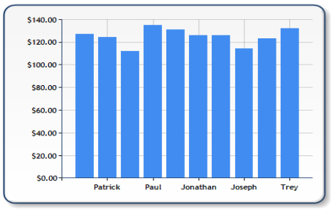
Just about everyone who has worked with category names on the Microsoft Reporting Services or .NET chart has encountered this problem: you databind categorical values from a database, but when it is displayed on the chart, it skips labels on the x-axis, like below:

How Do I Show All Labels on the X-Axis?
The short answer is, set the Interval property on the x-axis to 1:
// Show all labels on the x-axis
Chart1.ChartAreas[0].AxisX.Interval = 1;
Issues Created by Solving the X-Axis Label Issue
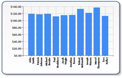
Showing every x-axis label produces the intended effect of matching every name to a data point, but it also causes clutter if there are too many points or the names are too long. For example, look at what happens when I databind first and last names of each sales person:

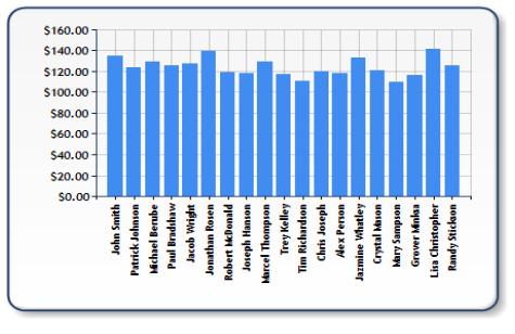
It gets worse if I show all sales people instead of the top 10:

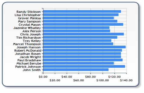
One satisfactory solution is to change the chart type to Bar:

This is a cleaner version of the previous chart, with the category labels more intuitively placed on the chart. If you’re going to use this solution, make sure you change the appropriate properties for the axes, since the x-axis and y-axis are reversed on a bar chart.
The x-axis skipping label issue tends to be a catch-22 for developers. It usually does not make sense to show every individual date along a financial chart if you are trying to graph a six-month trend of a particular stock price; in this case, you actually want the chart to skip labels. On the other hand, if you are showing sales performance by salesperson on a chart, there is no way you want any of those people skipped to simplify the trend of the chart.
For more information on implications of skipping axis labels, see: http://msdn.microsoft.com/en-us/library/bb934284.aspx
Also, if you are using the SSRS chart, you might want to consider implementing the really cool TableInlineCharts solution from Robert Brucker’s whitepaper: http://msdn.microsoft.com/en-us/library/aa964128.aspx#moressrscharts_topic4
This entry was posted on January 11, 2009 at 9:30 pm and is filed under .NET Chart, SQL Reporting Services. Tagged: Axis Labels, Bar Charts. You can follow any responses to this entry through the RSS 2.0 feed. You can leave a response, or trackback from your own site.
Piyush Vardhan singh said
it very help full for every body
thanks
Arunkumar S P said
Nice.
Aykut said
Great great line of code! Thanks.
Dustin said
Thank you very, very much. Had beat my head against this for probably 20 hours or better.
sree said
hi its a good article but i had a quick question regarding bargraph the scale in y-axis is bit of zig-zag like one value is up and other is down can you please provide me a solution for that.
milang said
Sree,
You need to turn off the staggering on labels:
chart1.ChartAreas[0].AxisY.LabelStyle.IsStaggered = false;
Hope this helps.
-Milan
sree said
thank you very much it works….
Timmy said
This article was very helpful. Thank you very much.
Sarvana said
Excellent article…
moisesribeirojr said
saved my life lol
Setting SSRS Chart Axis Interval Behaviour to Prevent Skipping every 2nd « POP-BI said
[…] https://betterdashboards.wordpress.com/2009/01/11/show-all-labels-on-the-x-axis/. […]
zoya mehta said
Chart1.ChartAreas[0].AxisX.Interval = 1;
thats it
Nick said
I have my intervals set to 1 but it is still skipping every other axis label. Why? How do I fix it?
ac said
Thanks a lot.
kkkh said
Thanks really useful
Vigyan said
Thanks for the help
tigg said
Where can I find this option?
I couldn`t find it inside the Advanced properties
Mohammed AbdulFattah said
5 Stars for this article.
That was very helpful. I was not able to find why my alternate labels are missing.
jice said
Thanks . It works
Micky Ross said
Wow. Can’t believe that such an esoteric solution is required to something so fundamental. Many Thanks.