One of the most popular charting trends over the last several years has been the increased importance of the secondary axis on a chart. When it is done correctly, adding a second series to the same chart area makes for a more colorful, richer and compressed visualization. However, when it is done poorly, it hurts readability, reduces effectiveness and causes endless grief for information purists. Here is an idea about how to maximize the usefulness of the secondary axis.
Basics of Secondary Axis
Once you have created a series on the chart, assign the series to the secondary axis:
// Assign the first series in the Series collection to the secondary axis
Chart1.Series[0].YAxisType = AxisType.Secondary;
If you are using the chart sample framework, the Secondary Axis sample is in a folder under ChartFeatures –> Axis –> PrimaryAndSecondaryAxes
Why Information Purists Hate the Secondary Axis
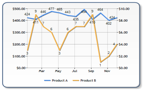
Most charts that use the secondary axis only complicate the meaning of the data by obscuring what is trying to be shown. Here is a chart that makes use of the secondary axis:

Based on the image alone, it is impossible to tell which series belongs to which axis. We have to add individual point labels to each data point in order to figure out how the data points relate to the axis. This causes more noise on the chart and undermines the effectiveness of the chart to simplify the data, like this:

Sidebar: as a general rule, if you have to add data point labels to every point so that the chart makes sense, you’re better off skipping the whole concept of using a chart and just put the data in a table.
The optimal solution is to separate the data into two separate chart areas but that isn’t particularly fun because now your visualization does not have the same kind of impact as it did when the axes were minimized and the color was maximized.
How to Improve Visualizations using the Secondary Axis
If you absolutely need to use the secondary axis to conserve space or to maximize visual aesthetics, one way to improve the visualization is to color the axes with the same color as your series:

Using this technique, there is a very clear association between the series color and the axis it belongs to. The key is this: instead of manually setting colors for the series, you can use the existing colors in the default palette to color the axis as long as you call the ApplyPaletteColors method in order to populate the data. Here is the code I used:
// The palette is automatically applied on the chart, so by default,
// you do not have access to the series colors.  Calling this method
// will give you programmatic access to the series colors in the chart.
Chart1.ApplyPaletteColors();

// Color the primary axis (AxisY) with the colors of the first series
Chart1.ChartAreas[0].AxisY.LineColor = this.Chart1.Series[0].Color;
Chart1.ChartAreas[0].AxisY.LabelStyle.ForeColor = this.Chart1.Series[0].Color;

// Color the primary axis (AxisY2) with the colors of the second series
Chart1.ChartAreas[0].AxisY2.LineColor = this.Chart1.Series[1].Color;
Chart1.ChartAreas[0].AxisY2.LabelStyle.ForeColor = this.Chart1.Series[1].Color;
What if I have more than two series on my chart?
The secondary axis works well if you have exactly two series on a chart. If you have more than two series on the chart, you are risking more clutter and you’re better off just using separate chart areas. In theory, if you had multiple axes (like the sub-axes feature introduced in Dundas Chart 6.0) you could repeat this technique endlessly, but the sub-axis feature did not make it into this version of the Microsoft chart control.
Good luck!